This step-by-step tutorial for beginners is a great place to start learning more about alcohol marker blending techniques. Even if you are familiar with the basics of using markers, if you want to level up your skills, keep reading to discover some of the advanced techniques we recommend. Have you been too intimidated to draw with markers because they feel so permanent? Give these marker techniques a try and you’ll be surprised by how much more forgiving and fluid the drawing process can be. Have you been frustrated by the so-called “blender markers” not working as you expected to blend colors? In this post, we’ll show you better ways to blend and how to really use a blender marker.
Before we get to the markers, we need to start with the paper. Successful marker blending begins with the right paper. Because blending techniques require lots of layering, the paper must be able to absorb the ink without becoming oversaturated too quickly. It needs to strike a balance between just enough bleeding to get the inks and alcohol to merge, but not enough to leak past the drawing area. The wrong paper can either not blend enough and cause unwanted streaks or will bleed too much, causing colors to feather. Check out our basic guide to alcohol markers for more detailed information on choosing the right paper for markers and more.
Blending and Layering with Alcohol Markers
The ability to create smooth blends is one of the main advantages of alcohol markers. The key to blending is to keep the area wet without letting the ink dry between layers. Find that sweet spot of coloring slow enough to let the alcohol seep into the paper but fast enough so that it doesn’t dry out. Once dry, it’s harder to get smooth transitions between colors and values, although you can go back over them to improve the blend later with more layers.
Keep coloring out from the wet edge, working fairly quickly to keep that leading edge wet so it will blend well with the next color. It’s helpful to practice different blending techniques so you can get used to the sweet spot, which can vary slightly between marker and paper brands.
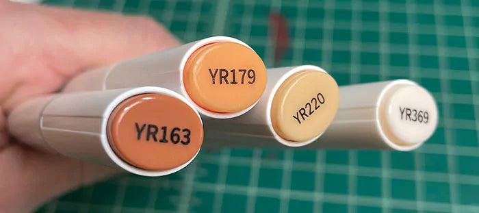
Before you begin a blend, plan ahead. The best blends come from using a range of values to transition from one value or color to the next. This is why you’ll find that marker brands feature multiple values of markers within one color family: one for dark, one for a step lighter in value, one for 2 steps lighter in value, and so on. Organize the color groups you plan to use in advance. To blend well, you need to work while the paper is still wet with the marker ink, so spending time searching for the color you need can cost you valuable working time. It’s hard to get a good blend between two colors with a big value difference between them, so use enough small steps between the different marker values for best results. It’s a good idea to test blends before you start so you’ll have a game plan.
Layering is crucial to successful blending. Work your color layers back and forth over each other until you get the blend as smooth as you want. When they blend, the inks are actually mixing together almost like watercolor, and you can push them towards or away from each other with the marker nib. In this way, the pressure of the nib almost acts like a palette knife, so the more you physically blend the colors, the smoother the blend can be. Be aware that the colors will darken with repeated layering, and the more alcohol gets added to the paper through layering, the more the ink may bleed past where you want it to. Repeated layering is the secret to getting the colors to blend. It’s like making a sandwich of color 1 over color 2 and color 2 over color 1, etc. until the blend is as smooth as you want. It’s best to work in smaller sections instead of all over a large area so that the ink stays wet while you blend, and you’re not having to rush around the image to create all the blends before the paper dries out. For example, if you have 3 flowers on a stem, work on one flower at a time, even if you’re using the same colors in each flower. It might seem like you’ll save time by coloring the lights in all three and then the darks in all three, but the blending may suffer as a result.
If you plan to blend, it’s a good idea not to color all the way out to the edge of a shape because the extra alcohol added to the paper can cause bleeds. Stop about 1/16 of an inch from the edge, then wait a few seconds after the blending has been done to see how far out the color will bleed. If, after some time passes, you still see some white areas near the border, you can touch those up while the rest of the ink is still wet. After a while working with the same markers and paper, you’ll become familiar with how much the layered ink bleeds and how much you need to compensate.
How to blend a smooth, large, single-color area without streaks
With a chisel tip, use straight, overlapping strokes and then go back over it in the perpendicular direction. You can also color in a circular motion. With either technique, you’ll need to repeat the layers a couple of times to get a smooth color. Each time you do, the value will go slightly darker up to a certain point, which may (or not) be desirable. That’s why it’s helpful to have a light-through-dark collection of the color families you want to use. You can use that lightest color to go over the entire area again to blend without affecting the value or color, which gives better results than using a colorless blender for the same purpose.

How to gradate a single color from dark to light to white
It’s very easy to make a gradation from dark to light with a single color marker. Since layering a color over itself creates different values, you can control the gradation by simply adding more or fewer layers. When blending the color into the white of the paper, a fun trick is to bleach the tip of the colored marker with a colorless blender. Holding the blender marker on top and the colored one on the bottom, kiss the tips together until you see the color fade from the top 1/16th inch or so from the top. You might need to move the colorless blender back and forth along the tip to get an evenly faded area, especially on chisel tips. In a zig-zag motion, begin coloring with the bleached marker tip, starting where you want it to fade from the white of the paper. As you continue coloring, the colored ink will let down into the marker, creating a perfect gradation. You can also do this with 2 colors to get a nice gradation from one color to the next.


How to create smooth blends starting with light to dark
- Using the lightest color in your color group, begin by coloring the whole area you intend to gradate, even if that color will disappear under the darker layer. This primes the paper with alcohol, which will make the inks blend together more easily. Because it’s a light color, you can go darker as needed without worrying it will be too dark at the beginning, leaving you little room for more variation. With markers, it’s always easier to go darker than to lighten up a too-dark area.
- Add your darkest color where you want it. Don’t color it as far out as you think you need it because blending will pull some of that dark for you, and it might go farther than you want.
- Add your middle value in the area between the dark and light colors. While adding it, color over the dark area with the middle value to blend the two together well.
- Using your lightest color again, color over the entire area between the middle value and the lightest value and color over the entire area of the gradation again, just like you did in the beginning. The lightest color will smooth the blend without adding much extra color or darkening the values. It also helps unify the colors, especially if you’re having to make do with a color that isn’t necessarily in the same color family but is close.

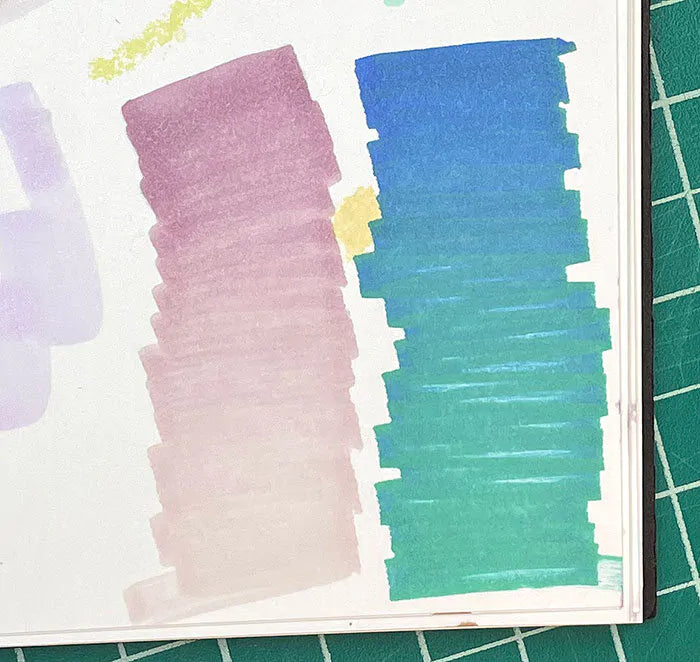
How to create smooth blends starting with dark to light
- Start with your darkest value and color where you want it to be, but not quite as far out as you want it to extend. The subsequent colors will pull it out farther, so you need to account for that.
- Add the medium value colored over the darker area and out as far as you want the medium value to be. Again, err on the side of less far out than you want it in the end because the lighter value will pull it out a bit.
- Add the lightest value where you want it to be and color it over the medium value to blend the transition, continuing over the darker area as well to facilitate the smooth blending of all the values. The more you layer the values, the more alcohol you’re adding to the paper, and the more the colors will blend.

How to blend different color families
It’s easier to get a good blend between different colors of the same value than it is a dark color into a different color family’s lighter color. The transition between values and colors is simply too great to get a smooth blend.
- Start with one of the colors colored up to the area where you want it to blend.
- Add the other color and overlap it with the first color.
- Repeat steps 1 and 2 until a smooth blend is created.

Another approach you can use is to create value gradations in one color from dark to light, then light to dark gradations toward the other color.
How to create optical blends with overlapping colors
You can create new colors and subtle color variations by overlapping the transparent colors of alcohol markers.

Also, if you color in a yellow-green that’s a bit brighter than you meant for it to be, you can mute it by adding a very light violet over the top. Violet and yellow-green are nearly opposite each other on the color wheel, so they mute each other.

Similarly, if you need a color in the moment that you don’t yet have in your marker collection, you can overlap 2 of its parent colors to create it. For example, if you want a dark blue violet but you only have a violet and a light blue, you can layer the light blue over the violet until it becomes more bluish.

Due to the markers’ transparency, any color you draw over another color will become another color. If you have a yellow bush already drawn that you want to give a slight pinkish cast, you can use a light, bright pink marker without fear it will be too bright because it will be dulled somewhat by the yellow underneath.
Similarly, you can get a variety of values from one marker color by using gray value markers in the under-drawing. Don’t have a dark green? Color in a dark gray as the first layer, then the green you do have. This technique works best when the gray and the color are fairly similar in value to begin with so that the gray takes on the characteristics of the color layered over it without overwhelming it. The gray undertone will, of course, mute the overlapping color, so you’ll want to account for that.

How to create soft edges and hard edges
Sometimes you want a softer edge between colors of values, but not necessarily a blended edge. This can be when you want to contrast far-away elements, such as the background in a landscape, with sharper foreground elements. To get soft edges, you can draw in the background sky and mountains, for example, and while that area is still wet, draw in the elements on the mountains, like trees and boulders. The edges will blend together slightly while the paper is still wet. Contrast that softness with the foreground, where you can use the markers directly on dry paper or a dry ink under-drawing. The edges will be crisp and sharp.

Another way to optically soften the appearance of edges when the ink is already dry is to choose colors that are closer to each other in both value and intensity. They won’t contrast sharply with each other and so the edges will appear softer. For optically sharper edges, choose colors that are more different from each other in intensity and value so the edges will appear sharper. Low-contrast areas tend to sit back in space and attention, while high-contrast areas come forward in space and attention. You might use low-contrast areas for backgrounds and parts of the image not intended to be the focus and save high-contrast areas for foregrounds and focal areas. This is basic color theory.
Can I lighten a color once it’s down?
Yes, you can…somewhat. You can lighten a color a little bit by using either a lighter color in the same color family or a colorless blender and scrubbing it into the area you want to be lighter. It can take some time and several layers for the lightening process to occur, so be patient and wait a bit before overdoing it. Be aware that lightening in this way will leave a dark line around the lightened area where the extra alcohol pushes into the existing color, which might not be desirable. This is one reason working from dark to light is preferable - it’s easier to make a light color darker, but not vice versa.
How and when to use a colorless blender
Blender markers don’t contain any ink, but they do contain alcohol and can be used to add colorless alcohol to the page for various reasons outlined below. Ironically, colorless blenders are really not the best tool for blending. They work best in that regard when they’re used to prime the paper before colored ink is added. Pre-wetting an area with alcohol is a good way to help the subsequent color layers blend better.
Colorless blenders are also useful for blending a light color into the white of the page. For example, if you want to fade a light color into the white of the paper. If used over darker colors or to blend already dry colors, it will create blooms that add a texture that may not be desirable. Therefore, it’s not a fix-all for blending that didn’t exactly go right the first time around.
Blenders can act as an eraser to lighten areas where you made a stray mark. Let the stray mark ink dry and then firmly scribble over it with a bullet tip or chisel tip as if you’re pushing the ink back behind the border it escaped from. The color will lighten a bit, although a stain may remain. If you add too much colorless blender, it will cause a bloom with a hard, dark edge, so be conservative. Of course, the lighter the color is to begin with, the better this will work. Dark colors will leave more of a stain. It may take a few passes with drying time in between to lighten as much as necessary.

You can also use a colorless blender to pick up a darker color that you want to blend into a lighter color to apply a smooth blend. Scribble some ink from your darker color onto a non-absorbent surface like a plastic or ceramic palette or plate. After you’ve colored the area you want to blend with a lighter color, you can use the colorless blender to grab some of the color from the palette and apply it as if it were the darker marker. As the picked-up ink is colored out, it will fade back to the colorless alcohol. Similarly, if you want to blend a color into the white of the paper but the color you’re blending is dark and you have no pale color to act as the transition, you can scribble the darker color onto a palette, then use the blender to pick up that color and act as the lighter transition color while you blend into the white of the paper. Don’t worry that you’ve ruined your blender with color! Before you put it away, clean it by scribbling on some scrap paper which will remove the colored ink.

A colorless blender can be used to make creative textures and patterns within colors. Use a bullet tip or chisel tip to achieve more pressure and carve back into the dry color to lighten it. You can create stripes, plaid, dots, swirls, scales, a tree trunk, etc. that are a lighter color than the background. Alternatively, you can use a brush tip and simply dab instead of scrubbing to lighten. It takes more time to work, so be patient. You can control the contrast by adding more alcohol or less, scrubbing more or less. If you create these effects on wet ink, you’ll get softer edges than if the ink was dry.

You can also use this technique to add highlights while the ink is still wet. If you wait until the ink is dry to go back in with highlights, you’ll get a hard, darker edge which may not be desirable.

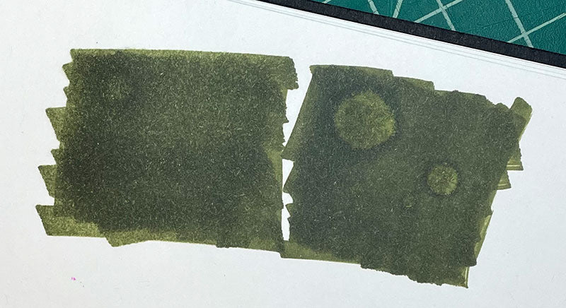
Similar to a blender pen, straight alcohol can be used to create some interesting textural effects. Fill a spray bottle with alcohol and spritz an area of dried ink. Wait a while for the alcohol to dissolve the color, and you’ll see lighter dots appear in the color. Or, use an eye dropper or brush to add alcohol onto a color, and a lighter area will appear.
Incorporating the versatility and creativity of alcohol markers into your drawing practice is great for planning in your sketchbook, taking visual notes on site, working through the design process, and finished works of marker art. We hope this information inspires as much as it informs. When you’re ready to get started, we have everything you need in our Art Markers and Marker Sets.


